- 首页
- International
- 艾特奖
- 文化节
- 服务体系
-
网站导航
滨河珑府销售中心设计说明
Design Description of Binhe Longfu Sales Center
Project name: Binhe Longfu sales center
Project address: Luoyang, Henan province
Construction area: 3000㎡
Developer: Jianye housing group (China) co., LTD
Design unit: Fengshang Decoration and Design, Henan
Designer: Caiyan, Wang Wenfei
Designer involved: Li Xiangdong, Zhao he,Li Yuying
Sales center, as a business card of real estate sales, mainly aims to attract people's attention.
销售中心作为楼盘销售的一个名片,要达到的效果之中吸引人们的注意力首当其冲。
This project is close to the river bank, and the surrounding natural environment is very good. The design concept of this residential area is ‘rivers and mountains’, reflecting the beauty of nature. The sales department is located in the south of the residential area and people can appreciate the beautiful scenery of the river over the Binhe road. Thus at the very beginning, the design concept was simple, atmospheric, close to nature, and tried to integrate into the environment.
这个项目紧邻河岸,周边自然环境非常好,该小区以山水作为设计理念,体现其自然之美,售楼部就在小区用地的南向,隔着滨河北路就可以观赏大河美景。所以一开始的设计概念就是简洁、大气、迎合自然,融入环境。
An excellent design needs to have a strong sense of visual impact and can identify itself from the crowd, which is called landmark architecture. Through the concise form and material language, the design should reflect the characteristics of the sales office.
设计需要有强烈的视觉冲击感和可识别性,也就是所谓的地标性建筑。通过简洁的形体和材料语言,要体现了售楼处的特点。
This is the first goal of the sales department design. So at the beginning of the design, we defined a few key words including church, bookstore, museum. These are the sites that have enjoyed a glorious history of human civilization. In the light of the feedback from current customers, the first point has met expectations.
这是本次售楼部设计的第一个目标。所以在设计之初我们定义了几个关键词,教堂,书店,博物馆, 这些都是在人类文明历史长河中留下辉煌的地点。从现在的客户的回馈来看,第一点达到了预期。
Now people are trying to pursue every detail of enjoyment. We want to give them a feeling of nobility. And compared to traditional wealth and luxury, the meaning of nobility should be introverted, implicit, slightly exposed and fine details. This is the second goal of this design:the details.
现在人们都在享受,不放过每一个细节的享受。我们要给他尊贵的感受,与传统的富贵与奢华比较,尊贵的含义应该是内敛、含蓄、锋芒微露、细节精致。 这是本次设计的第二个目标,细节.
We say that the decoration is a very detailed process, but the final presentation must have an overall feeling. In this way, we should handle the final presentation effect well, including the surrounding guidance system, doorways, periphery, building observation channels and other details to create a harmonious atmosphere of space.
我们说装修是一个很细的过程,但是最后呈现出来的一定是整体的感觉,因此我们要把握最终的呈现效果,包括周围的导示系统、门口、外围、看楼通道等空间氛围等的细节营造。
According to different functions, the sales office is divided into three floors. The first is used for reception, negotiation area, enterprise culture display, sand table display area and two sets of sample room display. The second floor is children's activity area, exhibition space of calligraphy and painting creations and one set of star apartment -- 179. The third floor is the office area for office sales and the supporting catering as well as business reception areas.
售楼处从功能上分为一层为接待、洽谈区、企业文化展示、沙盘展示区以及2套样板间的展示。 二层为儿童活动区,书画展示创作空间和1套明星户型——179 户型。 三层为办公sales 的办公区以及配套的餐饮和商务接待区。
Enter the reception area on the first floor along the corridor of the building, and the first display in front of us is the hollow Chinese character culture hanging wall, which not only has light and shadow effect but also highlights the cultural background of Heluo (a famous culture as a part of Chinese culture). If you turn left to enter the central control area, you can see nearly 8 meters of empty area below which is the longest book bar area in the Central Plains Region of China as far as I know. This book bar area belongs to the Sales Department. There is a custom steel table which is 16 meters long, and the lower supporting structure adopts the same arch elements as the void, which is unified in form. This table has an irreplaceable central role in special events. Second, there is also an obvious element of a big stair, which is the design of an innovation in the Sales Department. It is not only a visual center, but also a large balcony for events, and is used in line with the large HD LED electronic screen on the other side, which can satisfy various activities such as press conferences, lectures, TED speech and other multifunctional displays, a perfect combination of visual and function. This is our latest design language after tech-city 1.0 and Longcheng dongwang 2.0.
沿着看楼通道进入一层接待区最先展示在眼前的是镂空汉字文化吊饰墙,既有光影效果又能凸显河洛文化底蕴。左转进入中心调控,近8米的挑空区域下方是一个目前我所了解到的中原地区售楼部中最长的书吧区。这里放置有16米长的定制钢板桌,下部支撑结构采用和挑空一样拱门元素,形式上统一。在特殊活动中有着不可替代的中心角色。 其次一眼看过去的大楼梯元素,也是我们在售楼部设计中的一个创新,它既是一个视觉的中心,也是与动线结合的大型观礼台,配套对面的大面积LED高清电子屏,可以满足例如新闻发布会,讲座,TED演讲等多功能展示,视觉和功能完美的结合。这也是我们继科技城1.0版本,龙城东望2.0版本之后的最新设计语言。
The quiet waters outside the negotiation area as well as the sight beyond the grille extend from the outdoor to the indoor, organically connecting the indoor and outdoor spaces. The sun fell on the water with a dizzying radiance. The grid's projection onto the water is integrated with itself and the earth in the sunlight. The entire grille facade spans diagonally across the middle of the water, acting as a giant screen, luring sunlight into intimate conversation with the water.
洽谈区外安静的水域,视线越过格栅,从室外一直延伸到室内,有机的把室内外空间进行了连接。阳光投到水面上,漫射着令人眩晕的奇妙光芒。格栅在水面上的投影在阳光下与它本身、与大地浑然一体。整个格栅立面斜跨在水中央,仿佛巨大的屏风,引诱阳光与水面来进行亲密的交谈。
Negotiation area is set up for those who come to the sales office for the first time, and everything is just right in their places. Some people walking into this building just out of curiosity, but when they enter this space, the flowing light and the leaping light and shadow will gently touch certain corner of their heart, in which they will feel a strong desire for beauty which creeps into their blood and ready to cleanse their tired heart -- it makes me so moved that I just stand there and take time to appreciate everything.
洽谈区这个区域是专为那些初次来售楼处的客人设置的,一切都刚刚好。走进这个建筑体仅仅是好奇而已。但当你进入这个空间,流动的光线和跳跃的光与影,在某个瞬间轻轻地触动了内心的某个角落,身处其中,感觉到某种对美的热望正渐渐侵袭入血液中,并随时准备清洗疲惫的心灵----这感动促使我停下来慢慢地体味一切。
Finally, for various reasons, the wonderful idea of the water surface cannot be carried out. The large area of water is replaced by the black flower stone outside with the white pebble inside. The conversation of light and shadow vanishes silently on the ground.
最后关于水面的美妙设想由于各种原因仅仅停留在了方案,大面积的水域被室外的黑色花石和室内的白色卵石所取代,光和影的交谈在地面无声的停止。
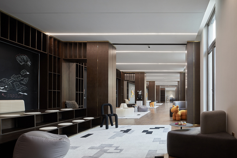
On the second floor, children are divided into two areas and four blocks. The large Lego wall provides space for children to play, which combines intelligence development and interest. What’s more, there are blackboard walls, magnetic walls in this space, in order to provide abundant space for children to write and draw, which enriches their vision of life here. Located in the innermost, there is a reading area, which provides a quiet space for children who love books. The children's area is tailored to the needs of children of different ages and personalities.
二楼儿童区分为2大区域4大块,大面积的乐高墙给孩子动手玩乐的空间,开发智力与趣味结合。另外还有黑板墙、磁力墙的空间,给写写画画的小朋友提供了充沛的空间,让他们能在这里尽情展现自己对生活的憧憬。位于最内侧的阅读区,给喜爱书籍的孩子们一个安静的空间。儿童区域充分考虑了不同年龄和性格的小朋友们的需求,为他们量身打造。
As light is an indispensable element of building, we can't put light here and there as freely as simple objects, instead we can guide it to where we want it to go, through windows, pillars and spatial structures and even make light become a clip-like process for purified vision in particular.
光线是建筑不可缺失的构成元素。我们不能把光线像简单的物体一样自由的放在这里那里,但我们能通过窗户、柱子和空间构造引导它到我们想要到达的地方。尤其是,当它成为纯化视觉的一种类似于裁剪的处理手法时。
The transparent glass of the whole building allows a large area of sunlight to penetrate into the interior of the building, while the linear grid cuts the whole piece of sunlight into strips, which perfectly integrates with the interior design, creating various spaces with different time and presenting different design languages. No words are beautiful enough to describe this wonderful situation.
在整个建筑透明玻璃让大片的阳光深入至建筑内部,而线性排列的格栅把整片的阳光切割成带状. 和室内的设计完美的融合,随着不同的时间,创造出一个个多变的空间,呈现出不一样的设计语言。此情此景,妙不可言。
In the design, in addition to considering the use and continuation of the space, the details are also dealt with greatly. The partition of the window is not a simple division, but is divided into three vertical sections, and the horizontal direction enriches the facade through the width and translucency of the window. There is a 1:2 relationship between the width of narrow windows and wide ones, so the facade will produce certain rhythm. Although the cost of it may rise a little, the beauty of the entire building has been significantly improved. In different parts of the building, among windows, there are certain relationships, in which the protruding vitreous body that faces the great river gives people a kind of concise and very meticulous feeling in good taste.
设计上考虑空间的使用与延续之外,在细节上也进行了处理。窗的分格不是简单的划分,而是竖向分为三段,水平方向通过窗的宽窄和透明半透明的变化来丰富立面,窄窗和宽窗的宽度存在着1:2的关系,所以立面会产生一定的韵律,虽然成本增加了点,但建筑美感得到了很大的提升。实体部位窗与窗之间彼此都有一定的联系,面向大河突出的玻璃体给人一种简洁大方、很细致的感觉。

儿童区

儿童区1

儿童区小景