- 首页
- International
- 艾特奖
- 文化节
- 服务体系
-
网站导航
项目名称:亚新.橄榄城新公馆LOFT样板间
设计团队:郑州筑详建筑装饰设计有限公司
设计主创:刘丽 张岩岩
项目面积:40平方米
设计时间:2016年6月
开放时间:2016年9月
主要材料:白色水性艺术漆(墙、地)、 橡木木地板、白色烤漆钢板、橡木木饰面
文 案:刘丽
所获奖项:2016 意大利设计奖室内空间A类铜奖
2016录制央视空间榜样栏目组榜样作品
设计关键词
Key Words
纯美/品质/自然/温馨/通透/轻盈
Pure/Quality/Natural/Warm/Ventilation & Lighting/Light
纯. 简
Pure · Simplified
“凿户牖以为室,当其无,有室之用”出自于老子的道德经。
It is said in the Book of Tao and Teh written by Lao Tzu that a real house shall be designed with doors and windows excavated in walls.
空容器,正因为其单纯、空白,所以那里才诞生了能够容纳所有人思想的终极的自由性。
物质的丰富及广告的无孔不入,让所有人生活在商业的牵绊之中,我们迷失了生活的本来意义。作为样板示范单位,本案反其道而行之,彻底抛弃生活日常所有的累赘。回归日常最单纯的本质。
Just like an empty container, it, just relying on pureness and blank, forms the ultimate freedom to hold thoughts of all. Abundant materials and advertisements seen everywhere have tied all people to the commerce, as a result, we are confused of the true life. As far as the showroom, the program acts in an opposite way, instead of daily encumbrance, and returns to the nature just as it should be.
克制所有的设计的动机,一切从生活的日常出发,研究日常最本质的行为及心里的设计需求与关照;把材质及色彩简化至最少,在一片虚白中植入天然橡木本色,亲和中透着自然,白色的纯美透着轻盈的空灵,充盈着至纯至简的禅性。
With all motives for design restricted, all, done on the basis of daily life, aim to explore the basic behaviors and psychological needs and care as designed; materials and colors are simplified to the minimum, a natural oak color is applied in a whiteness, compatible and physical, and the white pureness showing lightness is full of pure and simplified Zen Zen wisdoms.
40平米4.8米高度的空间,被设定为两房两厅一卫,简化至单纯的空间反而更具包容性,把洗衣洗漱综合柜及冰箱安放在楼梯之下,轻盈的楼梯踏步巧妙的与视听柜及餐桌椅完美的结合,解决了结构的生根有保证了是觉得简化。位于餐桌上部挑空保证了所有空间的光线充沛与相对独立的安静,一楼从视听墙至楼梯转向平台被延续拉伸的木板,把客厅、餐厅、厨房化整为零在满足所有实用功能的前提下,简化为最极致的单纯。
The space, 4.8m high and 40m2, is designed with two bedrooms, two halls and one toilet, the simplified and pure space makes it all inclusive instead, ward robe, washing cabinet and refrigerator are placed below the staircase, the light stair steps, combined with video and audio cabinet, dinning tables and chairs solves the rooting of structures and simplify the vision. The empty above the dinning table makes it easy for all the space access to adequate sunshine, independent and quiet. The board extending from the video and audio wall on the ground to the staircase turning support divides living room, dinning room and kitchen into pars, and the simplified and ultimate pureness are achieved with all functions provided.
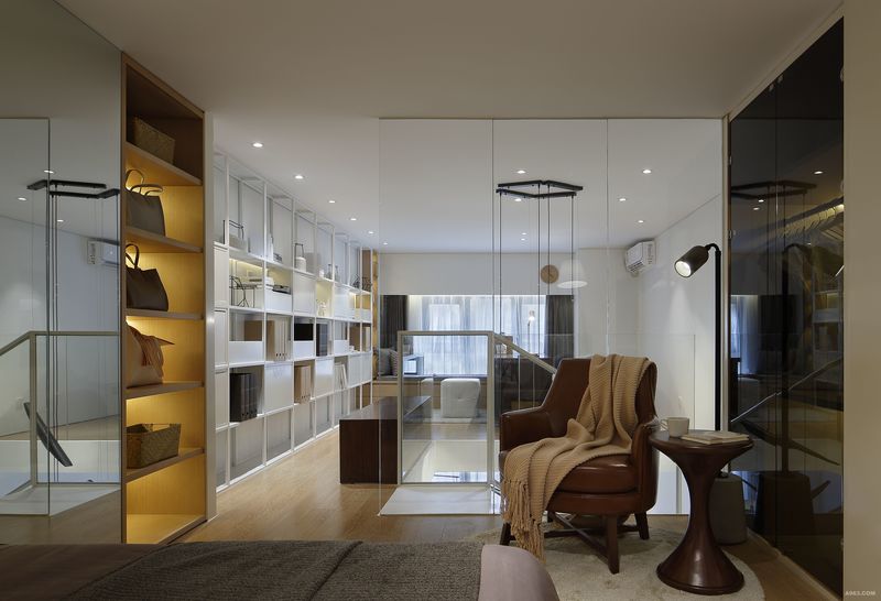
二楼整面的白色大书柜,不仅隐藏着家庭影院功能并拉宽了整个空间视觉界面,夹层地面的搭建时刻意避开窗户里面生根,与窗户空出400mm间隙,并在搭建是临窗部分被控制出两个标高,一个是二楼的地面确保二楼净高保证在2200mm,另一个标高作为临窗的坐踏及和平行移动的书桌支撑,做踏的下部不但隐藏大量收纳,足够大的尺度给生活日常提供更多的可能性。
The white bookshelf on F2, containing home theatre, widens the spatial vision, and the construction of ground in inter-layers reserves a 400mm gap with the window to avoid rooting in the window, and two elevations are kept for the part close to the window in construction: first, the net height on the second floor is kept at 2200mm, second, the another elevation is used as step for close windows and support for moving desks, the space below the step not only has a big space concealed and available but also provides more convenience for the daily life.
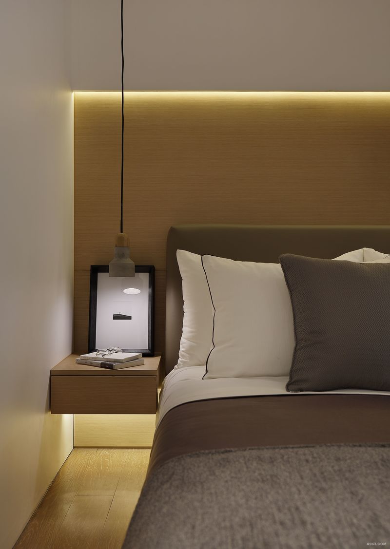
卧室被安放在最靠内的区域,内部隐藏的强大收纳让空间呈现最单纯的安静,玻璃的隔墙确保自然光线的充裕。利用原建筑结构的自然太高安放睡眠区,开放的尺度给日常提供更多的趣味性。
Bedrooms are arranged in the inner area, and the wide space concealed inside makes it pure and quiet, and the glass partition guarantees rich natural sunshine. The natural height of the architecture is used for sleeping and the open size makes it interesting in daily life
选择与空间理念同出一辙无印良品的家居产品作为陈设部分的呈现,以纯美的自然色系,定义陈设的色彩,它不强调所谓的流行,仅仅是一种简化生活态度的传递,回归生活日常最单纯的本质。
A household product with the spatial concept the same as MUJI is selected for display, and a pure natural color system is used to define that of the display, it is not centered on a hit but just a transfer of living attitude and a turn to the daily life.

主卧室角度三

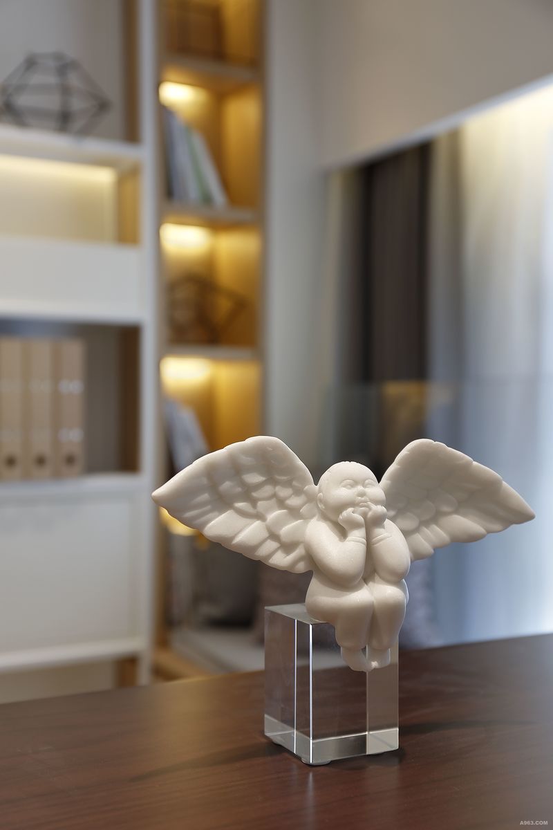
书房一角

主卧室角度四