- 首页
- International
- 艾特奖
- 文化节
- 服务体系
-
网站导航
项目地址:河南省郑州市
Project Address: Zhengzhou City, Henan Province
设计单位:阅梵堂装饰设计有限公司
Design Unit: Yuefan Tang Decoration Design Co., Ltd.
设计主创:张永
Design Creation: Zhang Yong
设计团队:高瞻 何莹莹 王天虎
Design Team:Gao Zhan He Yingying Wang Tianhu
设计时间:2018年4月
Design time: April 2018
开放时间:2018年9月
Opening time: September 2018
设计面积:200㎡
Design area: 200㎡
主要材料:钢板.白色灰色蛋壳漆.条形灯条
Main materials: steel plate, white grey eggshell paint, strip lamp
摄影: 孔彬
Photography: Kong Bin
丘壑
Gully
岳镇川灵,海涵地负。至于造化值神秀,阴阳之明晦, 万里之远可得于咫尺之间,其非胸中自有丘壑。发而见
诸形容,未必如此 宋:宣和画谱
Yuezhen Chuanling, Haihan District Negative. As for the beauty of nature, the brightness and obscurity of yin and yang, it is within ten thousand miles, and it is not a hill in the chest. Hair and see All descriptions, not necessarily so Song: Xuanhe Painting Spectrum。
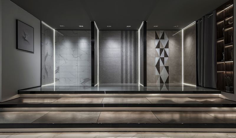
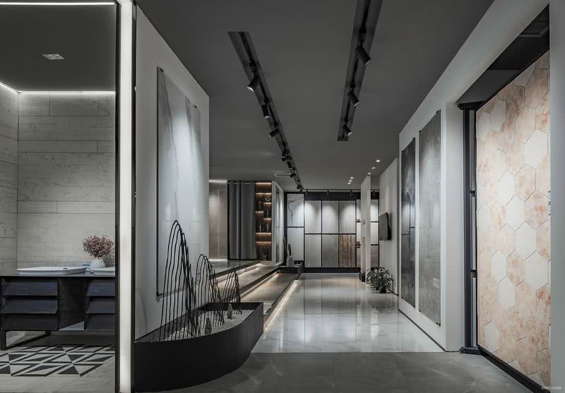
布局参考园林构造法则,采用造而不通,迂回曲折的手法。从门口透窗一眼望去,层层能见。布局用到了山壑的地形,打破传统的表现形式。把原本难以处理的柱子放在门外,做明珠。做精神堡垒。
The layout refers to the rules of garden construction, and adopts the methods of making but not making, circuitous and tortuous. From the doorway through the window, you can see from layer to layer. The layout uses the hilly terrain, breaking the traditional form of expression. Put the difficult pillars outside the door and make pearls. Be a spiritual fortress.
设计语言:在一个瓷砖店里加入了书吧,甜品店的一些特质。为了让用户更亲切些,在整个挑选产品的过程中不觉得视觉疲劳。每个区域都比较明朗,形散而意在,局中有丘壑,心中亦有丘壑。
Design Language: Books are added to a ceramic tile shop, some characteristics of a dessert shop. In order to make users more friendly, they do not feel visual fatigue during the whole process of product selection. Every region is clear, scattered and intentional. There are hills in the Bureau and hills in the heart.
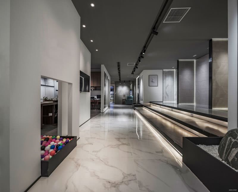
功能:从接待休闲开始聚人气,到每一个单品样间。小样间区是一个视听多功能区,选材区是一个西式岛台茶水台,边上有个儿童多彩球区。同时商业空间的目的是为了销售.通过室内设计极简特征使得产品本身的颜色鲜艳色彩更加突出,从而吸引顾客走进这个朴素的店面.
Function: From reception leisure to gather popularity, to each single sample room. The sample area is a multi-functional audio-visual area, and the selection area is a Western-style Island tea table with a children's multi-color ball area beside it. At the same time, the purpose of commercial space is to sell. Through the minimalist features of interior design, the product itself has more bright colors, thus attracting customers into this simple store.
抛开空间本身带来的感官体验,还向观者展示了产品本身的多种表现方法。多样的瓷砖产品被运用于各种体块和墙体的表面,以强调产品在不同形态和语境中的表现力,以及不同功能空间中得以呈现的实际效果。通过观看和摸,观者可以感受到材料的品质,进一步突显并强化产品本身与空间设计之间的密切联系。
Apart from the sensory experience brought by space itself, it also shows the viewer a variety of ways to express the product itself. Various ceramic tile products are used on the surfaces of various blocks and walls to emphasize the expressive force of products in different forms and contexts, and the actual effects in different functional spaces. Through watching and touching, the viewer can feel the quality of the material, further highlight and strengthen the close relationship between the product itself and space design.

展示区角度二

展示区角度三

展示区角度四